
|
|
posted: December 27, 2020
tl;dr: The economic, investing, and business worlds look very different if you use our old monetary yardstick...
One of the fun things about the end of 2020 is that we are now, regardless of how you demarcate the start of this century (January 1, 2001 is more technically correct, but January 1, 2000 is more popular), 20% of the way through the 21st century. So how are we doing, from an economic perspective?
It depends on how you measure it, and in particular what monetary base you use. More than 99% of the time, when commentators in the United States speak about the economy, prices, transactions, and the stock market, they are using dollars as the monetary base. Sometimes they don’t even bother mentioning the units they are using, as during the recent excitement about “DOW 30,000”. 30,000 what? Casual market observers may not even know that this figure is implicitly stated in dollar terms. “DOW $30,000” would be more precise. Software developers are perhaps more attuned to what base is being used, since we regularly use different number bases and have to convert between them.
Here’s one way to look at the performance of the U.S. stock market this century. This is a graph of the S&P 500 Total Return index, using the closing price on the last day of each month starting with January, 2001 (the raw data is from Yahoo Finance, symbol: ^SP500TR). The oft-quoted S&P 500 Index is a price index; to measure the total return an investor would receive by buying into the S&P 500 Index at a given point in time, it’s better to use the S&P 500 Total Return index. Companies in the S&P 500 occasionally pay out dividends: the S&P 500 Total Return index effectively reinvests all those dividends back into the S&P 500 Index, to stay fully invested.
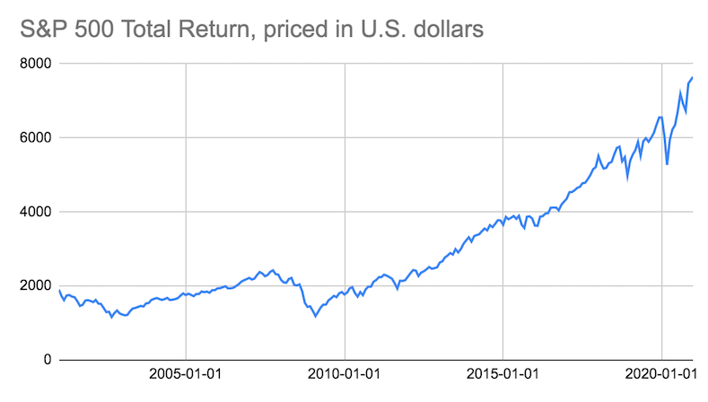
The general narrative that the graph tells is probably familiar to most stock market observers. In 2001, the stock market was still suffering from the excesses of the dotcom/Internet/telecom bubble, and went down for several more years before rebounding and setting new highs. Then in 2008 the stock market plunged again as the housing bubble burst, which kicked off the Great Recession. The market bottomed early in Obama’s first term, then began a remarkable climb during Obama’s presidency, which continued through Trump’s presidency, regularly setting new highs. At the onset of the COVID-19 pandemic, the stock market declined, but it executed a quick “V-shaped” recovery and has resumed setting new highs. Overall, there have been declines, but the stock market has always bounced back. Long-term investors who bought on January 1, 2001 and held are today sitting on some nice profits. Some stock market observers think that the market is overpriced right now and may fall in the future, but for the time being most investors are happy.
There’s a potential major flaw in this analysis, however. The problem with using U.S. dollars as the monetary base is that the quantity of dollars in circulation, and the price of U.S. dollars, is itself subject to major variance over time. The most common adjustment made to take dollar variance into account is to restate economic data in “inflation-adjusted dollars”. A dollar at the end of 2020 doesn’t buy as much, in general, as a dollar at the end of 2000. If the graph above were restated in “inflation-adjusted dollars”, it would have the effect of raising the graph on the left hand side, which would reduce the overall size of the increase in the graph. It would still go up, just not as much.
The U.S. dollar, however, is a relatively young currency. Although the U.S. dollar was initially defined in 1792, it was originally a unit of weight of silver (literally a “silver dollar”), or gold via a fixed silver-to-gold ratio. The dollar remained fixed to gold up until 1971. So it’s only been in the past 50 years that the U.S. dollar has been an independent currency. Gold, by contrast, has been used as money for 5,000 years. So, it’s reasonable to look at how the stock market is doing so far this century when priced in gold:
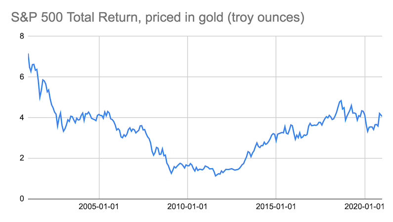
This graph tells a different story. The stock market went down after the dotcom/Internet/telecom bubble burst, and didn’t recover: it plateaued. It then started going down as the housing bubble was reaching its final years, and went down significantly as the Great Recession set in. The market has since recovered from those lows, starting in Obama’s second term, but it is still not close to where it started the century. If you bought and held at the depths of the Great Recession in the 2009-2012 timeframe, you are sitting on some decent profits. But if the stock market is overpriced right now, and may fall in the future, many more investors who bought at various times this century will have losses.
Is this second analysis overly harsh? That’s up to the reader to decide. The graph does show that an investor who put his or her money into gold on January 1, 2001, has done better so far this century than someone who bought the S&P 500 Index and reinvested dividends. Mutual fund money managers are paid a lot of money to beat the S&P 500 Index; yet simply holding gold, the U.S.’s old money, is one way to have done so. Executives in public companies often have compensation packages tied to how the company’s stock performs over time; yet how many of those executives have boosted their company’s stock price when measured in gold? Can you outperform a lump of metal, in the U.S. economy of the 21st century?